Theoryland Resources
WoT Interview Search
Search the most comprehensive database of interviews and book signings from Robert Jordan, Brandon Sanderson and the rest of Team Jordan.
Wheel of Time News
An Hour With Harriet
2012-04-30: I had the great pleasure of speaking with Harriet McDougal Rigney about her life. She's an amazing talent and person and it will take you less than an hour to agree.
The Bell Tolls
2012-04-24: Some thoughts I had during JordanCon4 and the upcoming conclusion of "The Wheel of Time."
Theoryland Community
Members: 7653
Logged In (0):
Newest Members:johnroserking, petermorris, johnadanbvv, AndrewHB, jofwu, Salemcat1, Dhakatimesnews, amazingz, Sasooner, Hasib123,
WoT Interview Database
Home | Interview Database
Interviews: A Memory of Light Cover Art Round-Up
Summary:
Entries
6
Date
May, 2012
Type
Verbatim
Reporter
M.R. Jackson
Links
-
1
Terez
The tor.com post about the Whelan art is copied in full and parsed for tagging, but there are some plot-relevant bits from a friend of Whelan's in the comments that are recorded at the bottom, and I've clipped the relevant bit about the DKS art from Tor's tribute post.Irene Gallo
The scene depicts Min, Aviendha, and Elayne gathered on a battlefield around what is presumably a funeral pyre for Rand al’Thor, the Dragon Reborn. What we recognize as a yin/yang appears in the clouds, possibly signifying a unity that has evaded male and female channelers for over 3000 years.
DARRELL K. SWEET

Tags
, , , , , , , , , , , -
2
Irene Gallo
We are very excited to reveal the cover to A Memory of Light, the final volume of Robert Jordan’s epic fantasy series The Wheel of Time. The artwork for this final edition is by, arguably, one of today’s most beloved illustrators, Michael Whelan.
The task of jumping into a 14 volume series on its last installment must have been a daunting one but Michael rose to the occasion. Harriet McDougal, Jordan’s editor and widow remarked, "that is the Rand I have waited to see for twenty years” when she saw the image. And while the artwork clearly has all the earmarks of a Whelan painting, its theme and coloration make it a fitting heir to Darrell K. Sweet’s series of Wheel of Time covers.
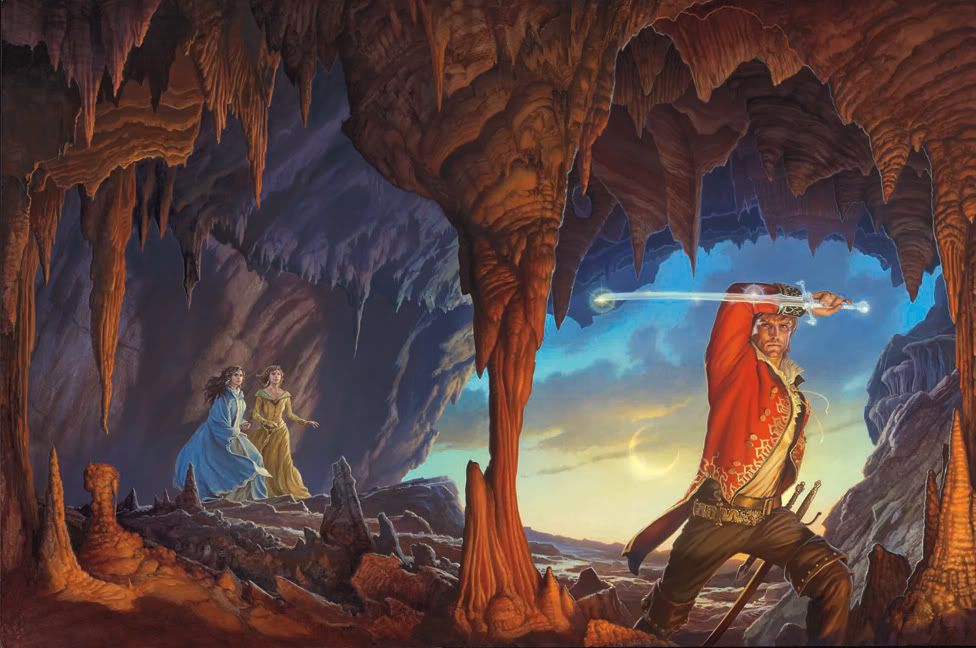
In keeping with the series’ covers, the scene gathers elements from a key scene in the book. Here, Rand stands with Callandor on the rocks of Shayol Ghul, heading down into its depths to confront the Dark One even as the sun itself vanishes from the world. Two Aes Sedai follow the Dragon Reborn into the mouth of darkness, two women who have been with Rand since the very beginning.
MICHAEL WHELAN

Tags
, , , , , , , , , , -
3
Michael Whelan
As you know, there was a specific scene already chosen as the source idea for the cover image, so I was spared going through my usual process of reading the book, then trying to distill it into one image. I often lose a lot of time trying to pick which scene or cover idea to go with from the narrative. On the other hand, there was a lot of research required to familiarize myself with the particular attributes of the three characters I knew were going to be in the image. Not having read the Wheel of Time series yet, I had a lot of catching up to do! I knew a cave was going to be in the image, so the question then became “should we see the characters from the outside going in or from the inside as they are entering?” While I mulled the possibilities over in my mind I began to sketch out some poses and costuming ideas, trying to feel my way into the image.
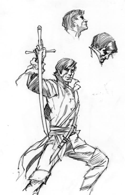
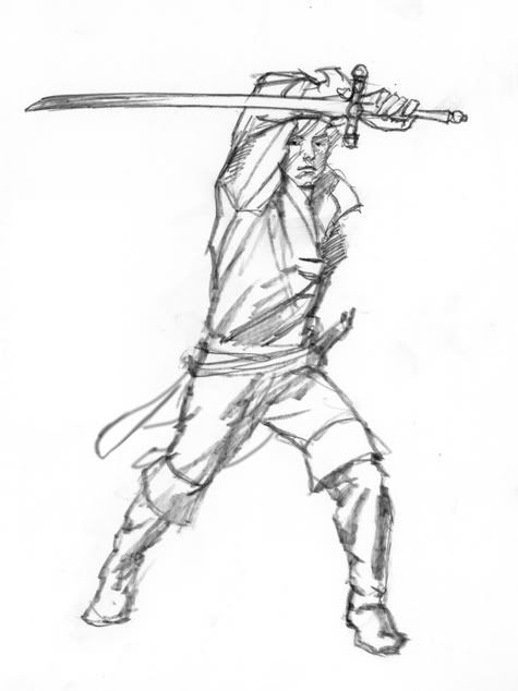
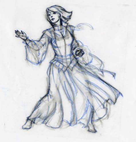
Then I did several preliminary layouts in monochrome acrylics or digital media, sometimes going back and forth between the two.
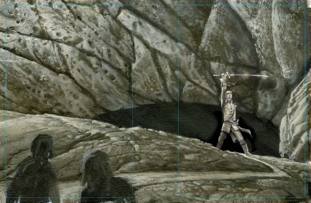
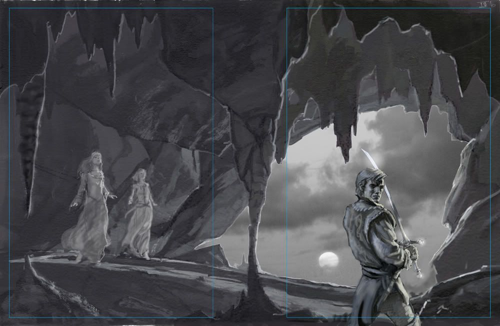
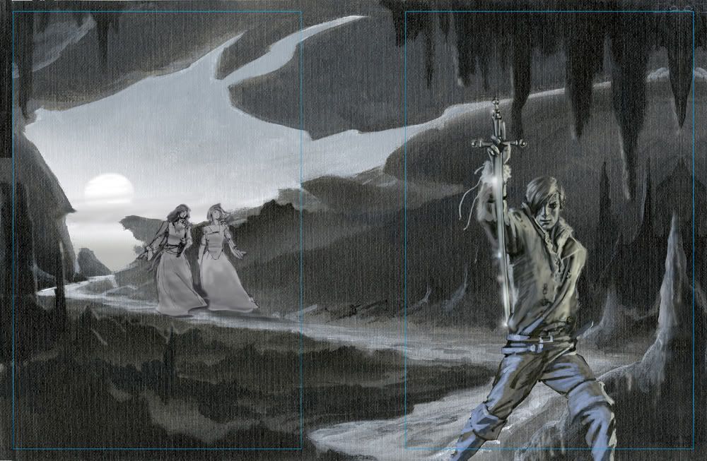
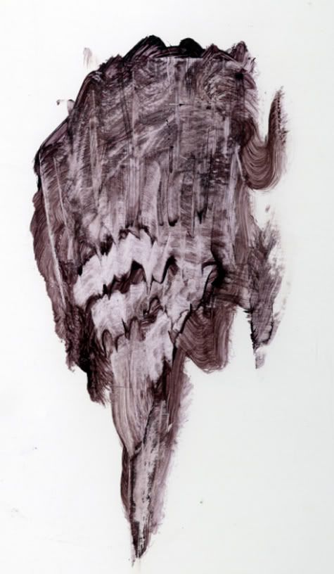
After it was decided which concept to go with, I first played around with my acrylics experimenting with making stalactite shapes using paint and a squeegee. After that, I felt ready to start the background work. Usually I work from background to foreground, but this time I decided to work the middle area first, then do the figure of Rand and the background/sky area at the same time.
Here’s a few shots of the painting as it progressed. The background color of the panel was a light grey tone. The acetate in the center was left in place to mask out the sky area and keep it clean until I was ready to work on it.
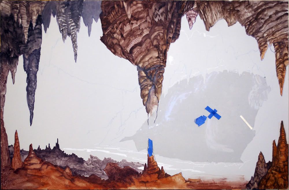
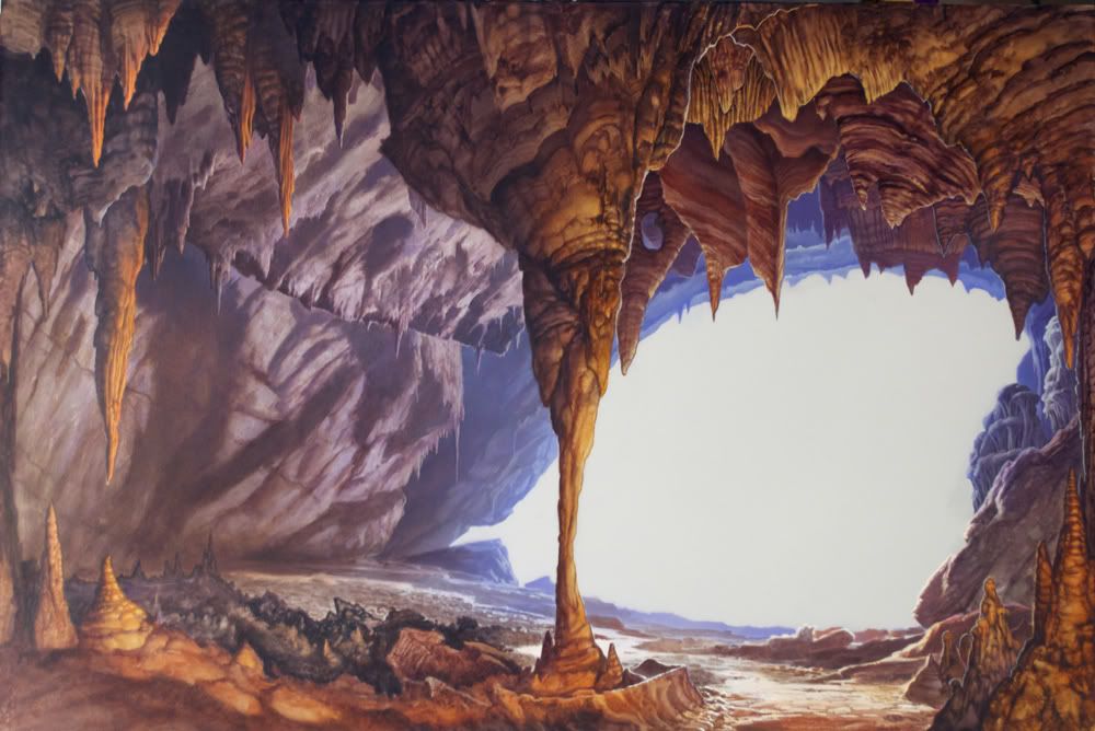
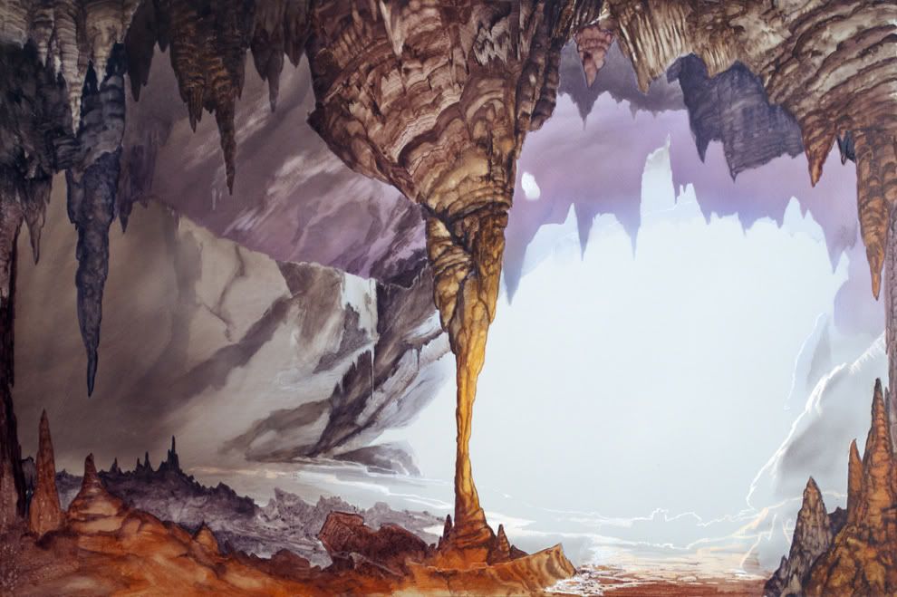
I was fortunately well supplied with cave photos to use as reference because I had recently gone to Carlsbad Caverns in New Mexico, where I took some pictures of some pretty strange stuff:
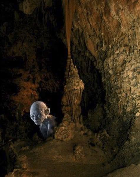
But I wasn’t happy with my visualizations of the figures, especially Rand. I tried using myself as a model, without much success.
I was also feeling frustrated about the coat I wanted to have Rand wearing in the picture. Sure, I could have faked it if the figure was small in the picture, but with Rand being so “up close and personal” as it were, I thought I should take the time to get it right.
I mentioned all this in a conversation with Dan Dos Santos, and he graciously took the time to help me find a model and find the kind of coat I was looking for. He introduced me to famed illustrator Edward Vebell, which was a humbling experience, I can tell you. Ed’s had a stellar career and is a real pro’s pro—and there were stacks of his paintings all over the place, amazing stuff from the 1940’s onward.
But the thing is, Ed also happens to own an amazing costume collection which he rents out to other artists, photographers, theatre productions, etc. Dan and I almost got lost in his attic looking through the hundreds of coats and military uniforms. We found a couple of likely candidates, and the next day the model came to my studio and Dan shared his photo and lighting setup with me so I could try out his equipment setup.
It was great; almost too good, actually. I felt a little like a guy wearing several watches and never knowing what the real time is. There were so many good reference photos to work with it was hard to cull out one or two to work from and leave the rest. The main thing I look for in posing a model is to check the reality against my visualization of a pose, and correct any errors. Once I had the information I was looking for, things proceeded at a steady pace until the painting was complete.
Tags
, -
4
MRJackson@218 (7 May 2012)
Not sure why there's still confusion. It's Nynaeve and Moiraine on the back cover. The yellow and blue dresses should make that apparent. Nynaeve's hair is obviously shorter than it used to be.
I spoke to Michael about the cover as he was finishing it. Since he didn't have the opportunity to read all fourteen books for the assignment, I was one of the people he leaned on to fact check his work.
Michael mentioned there are details the readers (like me) wouldn't be privy to yet. For example, Nynaeve takes the bulk of her jewelry off before this scene.
Callandor is a sword that isn't a sword, right? He's not holding it for defense. It's a source of power as well as his source of light (there's a clue about that in the lighting on his face). He's shielding his eyes as he stares in to the pit. Apparently, the deeper he goes into Shayol Ghul, the brighter it shines.
A little background that some might not know... Michael has studied martial arts, including Filipino Kali and Arnis. The forearm slash position actually has some utility in fights with bladed weapons.
Compositionally, the line of the sword is another element that draws you into the intensity of Rand's stare. Further, the opening of the cave is the shape of an eye; the eclipse suggests an iris. It's as if the gaze of the Dark One is falling on Rand. We see his strength and determination in response. How many illustrators can convey that kind of depth in a scene?
Say what you will, but I think Michael brought a lot to the plate on what was a very difficult cover assignment. He put his stamp on Rand while producing a cover that fits well with the first thirteen that DKS painted.
analiese@222 (8 May 2012)
Thanks for confirming that. However, Nynaeve's hair is still the wrong color and, while it's shorter after the Aes Sedai testing in Towers of Midnight, it should still be in a shoulder-length braid. She never gave up her signature braid. That's why many people don't think it looks like Nynaeve—the braid is the main thing that would identify her as Nynaeve to the readers.
The loose light hair makes the woman on the cover look more like Alivia, who many fans believe is the woman in yellow. So I'm still of the opinion that Whelan did not do a good job with Nynaeve if longtime fans don't even recognize her. I think it's a beautiful cover, but as a reader, the main thing I care about is seeing the characters—who we have been reading about for twenty years—done right, not so much whether the cave looks realistic or happens to symbolize the Dark One spying on Rand. So it's disappointing that Nynaeve ended up virtually unrecognizable. She doesn't even wear yellow dresses in the books, despite being Yellow Ajah (she makes a point of wearing green or blue since that's what Lan likes), so that's not something that makes the woman's identity apparent either.
If you don't mind me asking (not trying to be rude here, it just strikes me as a bit strange), why did Whelan rely on fans to check his work instead of Team Jordan? I'm assuming you work for Tor, but you refer to yourself as a reader who hasn't read the book. To what extent were Brandon Sanderson and Team Jordan involved with the creative process behind this cover?
MRJackson@223
I was just one of the people helping with the details. Obviously Michael had Irene Gallo's art direction and was in contact with editors including Harriet.
Michael's wife Audrey usually serves as his sounding board, but she hadn't read the books. (For the record, I'm not affiliated with TOR. I've worked with Michael since the mid 90s, primarily on his website.) I'm a WoT fan and that's the kind of feedback Michael was looking for... someone he knew who had read the previous thirteen books.
Michael and I did discuss Nynaeve's dress color. I mentioned that she catered to Lan's color preference of green and blue. The yellow of her Ajah usually came in slashes of color, accents if I recall correctly.
Like I said, I haven't read the manuscript for A Memory of Light and Michael couldn't talk about it. But I distinctly recall Nynaeve taking pride in being a true Aes Sedai finally. Going into the Last Battle, I don't think it's a stretch that she would choose yellow. I suppose we'll have to RAFO on that.
In the background information I provided, I described Nynaeve's hair color as darker brown and referenced previous covers (among them the Melanie Delon's cover for A Crown of Swords that drew criticism for being too red).
I'd have to ask him why he chose lighter highlights. Just my speculation here, but Callandor is a light source. There's also illumination from the eclipse filtering in from the mouth of the cave to consider.
Michael got the length of Nynaeve's hair right, and this isn't simply opinion. Hopefully Brandon or Harriet will confirm at some point that her shoulder length hair was too short to braid.
Interestingly, Michael and I spoke about the challenge of pulling character descriptions from the text. If you're familiar with his illustration, he's known as a stickler for details. But it isn't always easy to translate text literally, especially when Jordan and Sanderson contradict in their description.
In correspondence, Michael wrote,
Michael Whelan
"Major characters are described as diminutive in size, yet 'commanding' in presence. Faces are youthful, yet ageless. Or young but having eyes full of wisdom of the ages. Rand is tall and manly, yet has an almost "feminine" beauty in his eyes or mouth. It's a bit confusing how one is supposed to render such conflicting elements."
MRJackson
Honestly, I don't mind the nitpicking. Criticism comes with the territory. My point in responding is to state that Michael was mindful of details here. There's evidence of it in the painting. I can tell you that he had Moiraine's kesiera and Nynaeve's ki'sain accounted for before I even spoke to him.
On a personal note, I had the privilege of meeting Robert Jordan before a signing on the Knife of Dreams tour. One of the things we talked about was the cover art for the series. I think Mr. Jordan would be pleased with this one. Obviously Harriet was when she said, "that is the Rand I have waited to see for twenty years."
analiese@224
Firstly, thank you very much for the thorough answer. It answered many of my questions, and it was also interesting to hear more about the creative process behind the cover.
[Nynaeve's hair] got singed off "a handspan below her shoulders" (Towers of Midnight ch 20), and she wore a shoulder-length braid in every scene she was in after the Aes Sedai testing. That's why it seemed odd for her signature braid to be missing on the cover. I don't really care about the dress or even much about the hair color, but Nynaeve isn't Nynaeve without her braid—it's part of who she is. It's like Mat showing up without his hat and ashandarei. And the ki'sain is too small to be visible, so it doesn't do anything to make the woman on the cover look more like Nynaeve.
I also wish Nynaeve and Moiraine hadn't been delegated to the background/back cover—since they're going to be linked with him, they deserve to stand at his side. But that's not an error, just something I wish were different.
However, while the cover isn't what I hoped for, I understand and deeply appreciate that you and Whelan both worked incredibly hard on it, and Whelan remains one of my favorite illustrators. I think he did a wonderful job with Rand.
MRJackson@228
I appreciate the sentiment but Michael did the actual work. He pushed his calendar aside this spring to make the cover happen. I was just support. But I will admit it took a lot of restraint on my part not to inundate him with questions that I knew he couldn't answer, so there is that.
As readers, we all have so much invested in this series that I completely understand what you're saying. I love Brandon's work, but I felt Towers of Midnight was a bit of a letdown, especially the resolution with Moiraine.
Moiraine has always been a favorite of mine. I would have liked to see her on the front cover as well. Thankfully Dan Dos Santos gave us that in his brilliant cover for The Fires of Heaven.
Wetlandernw@227
I think MRJackson & Mr. Whelan made a very good point, in that we have not yet read this book. By the time this scene happens, we may see several other events that make sense of the seeming discrepancies. Specifically, there are only two scenes after Nynaeve's testing which mention her braid, and in both cases it is specifically noted that it is too short and she finds it quite annoying. Quite possibly she'll meet up with Lan and find out that he likes it loose, or she'll simply decide that it's too irritating to fuss with a too-short braid, and we'll see her with loose hair in several scenes before this.
Someone was bothered earlier by the missing jewelry—but now we know that she specifically and deliberately removed the jewelry before this scene, probably so that someone else could use them. (That's what happened during the Cleansing; why not here as well?) Seems to me that we should make the assumption that the same kind of thing might happen with The Braid, instead of insisting that she should look like she did in the previous book, and claiming any discrepancies as mistakes. Such claims are not only rude, they are unfounded. Once the book is out and we've read the whole thing, we might have grounds for nitpicking; until then, not so much.
MRJackson—Thank you for your contributions, both to this thread and to Mr. Whelan.
MRJackson@230 (9 May 2012)
Glad to be of help. Maybe someday we'll find closure in the great braid debate...
Seriously though, Michael painted Nynaeve's hair at that length (without a braid) for a reason. I wasn't trying to sidestep debate. I was expressing certainty. Michael was aware that the braid was an identifying feature of her character. The painting turned out the way it did through a long process that involved editorial input. I'll leave it at that.
I look at it this way (and this is my opinion)... Nynaeve has grown enormously through the books. She was always uniquely powerful, but it took time for her to grow into that power. More so, it took a dozen books to accept herself and decide who she wanted to be.
Nynaeve worked through enormous difficulty to channel reliably. Remember how she used to tug on that braid? It really was a symbol of who she used to be. Kind of fitting that the symbol is gone.
Old habits die hard, of course, but she isn't that girl tugging on her braid any more. She's a woman who fought to gain acceptance as an Aes Sedai, and she's going to stand at Rand side to face the Dark One. It's impressive how far she's come as a character.
analiese@
The Fires of Heaven ebook cover was definitely one of the best, though there were a few things the artist got wrong (Moiraine does not have blue eyes). The New Spring cover was great too, especially Lan. It's mostly Nynaeve who has suffered bad luck with the ebook covers. There's A Crown of Swords where she got red hair and Lan looked like an underwater zombie, Winter's Heart where she didn't appear at all despite being linked with Rand for the Cleansing, The Path of Daggers where she got a Saldaean nose and Elayne looked suspiciously like Jean Grey...
I think much of my disappointment with the A Memory of Light cover stems from the fact that there's already an earlier cover (Winter's Heart) where Rand claimed the stage and his female linking partner was left out. "Hero poses manfully brandishing some kind of phallic object" is a pretty tired concept, especially on WoT covers. Rand does the same on Sweet's The Dragon Reborn and The Path of Daggers, the ebook covers for The Dragon Reborn, Winter's Heart, Knife of Dreams... Winter's Heart is probably the worst offender, if you look at the placement of the Choedan Kal. ;)
Sweet's A Memory of Light cover was a welcome break from that—I'm not usually a fan of Sweet's covers, but I liked that he gave Elayne, Min, and Aviendha a prominent role and added some emotion to the cover. So I really would have liked to see something different on the final cover, like Rand having the two women from the Callandor circle at his side. Here, Nynaeve and Moiraine are present, but only in the background, and not at all on the ebook cover.
MRJackson@236
The only female lead who held the cover spotlight on par with the men was Moiraine, and that is a shame.
There was definitely opportunity to feature Nynaeve linked with Rand on Winter's Heart. Despite the hair, I liked Nynaeve on the cover of A Crown of Swords. Lan not so much. The Path of Daggers was another miss, mostly because the colors were a distraction. I thought I was looking at an X-Men cover. Even if that was intentional, it didn't work for me.
I can only assume Rand was intended to stand at center stage alone on the last cover, but I think what you suggest would have been great too. Moiraine and Nynaeve definitely earned their place at Rand's side on the front.
ViciousCircle@264
That was a beautiful description of why Nynaeve is one of the most compelling characters in the series. She and Moiraine kept me invested during some dark years of almost giving up on WOT. I always hoped they would be the other Callandor channelers, as I could not imagine Rand putting himself in such a vulnerable position with anyone else. Aviendha, Min and Elayne included, though I do love Aviendha! So thank you for shedding light on why some things are portrayed as they are on this excellent new cover. Just don't think that it will put a dent in the debate. ;)
MRJackson@266
Thanks. I feel much the same way about those characters, and I'm sure the debate will keep going on well after the publication of A Memory of Light.
Tags
, , , , , , , , , , , , , -
5
Terez@232 (9 May 2012)
Mr. Jackson (your name isn't Michael is it? because that would be unfortunate),
Thanks for the reassurances. Do you happen to know if specs were given for the eclipse? We're wondering if we can assume it's accurately portrayed from the perspective of an astronomer (we have one of those at Theoryland, and a hobbyist as well). That's not to say we can figure anything out about it right now, or even that we'll be able to figure it out when the book comes out judging on recent portrayal of chronology. Just curious. No worries if no particular care was taken to portray it accurately; I understand it's complicated, but it could have been made simple if RJ left notes about it. Also curious as to why it didn't show up until the final draft.
MRJackson@235
We didn't talk about it, but I can ask him. Michael has more than a passing interest in astronomy so it's possible.
And M and R are my initials...
MRJackson@238
Michael's response:
Michael Whelan
The few pages of manuscript I was given to work from didn't have any mention of an eclipse. The subject didn't come up until I had done several conceptual renderings. After sending some of them to TOR I got an email from Irene telling me that if I showed the sky through the mouth of the cave I might want to work an eclipse into the scene.
For reference I looked at a lot of photos of eclipses and liked the idea (for symbolic reasons) of indicating an imminent annular eclipse, the kind where the moon doesn't entirely cover the sun but leaves a thin ring of light in the sky.
Tags
, , , , , -
6
MarioInOttawa@265 ()
Anyone know why his left hand is hidden? I think it is because his hand grows back and they didn't want to give that part away (The Dragon Reborn is causing all sorts of broken things to go good again).
MRJackson@266
Nice thought but Michael was just hiding the stump.
Tags
, , , ,